With the ever-growing volume of data, effective data visualization has become essential for businesses of all sizes. In 2024, a diverse array of tools cater to various needs and budgets, helping you transform complex data into compelling stories. Here’s a breakdown of popular categories and leading contenders:
Interactive Charts and Dashboards:
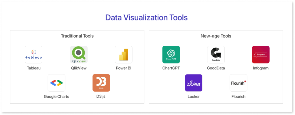
- Tableau: A popular choice for interactive dashboards and data exploration, offering a wide variety of chart types and customization options. Integrates with various data sources.
- Microsoft Power BI: A comprehensive tool with powerful data visualization, reporting, and data modeling capabilities. Integrates seamlessly with other Microsoft products.
- Looker: A cloud-based platform offering data exploration and visualization with a focus on collaboration and security. Features advanced data filtering and aggregation.
- Sisense: Offers interactive dashboards and data visualization with an in-memory analytics engine, enabling fast exploration for large datasets. Strong in mobile-friendly visualizations.
- Domo: A business intelligence platform with a focus on interactive dashboards and storytelling. Offers pre-built connectors and industry-specific visualizations.
Open-source Options:
- Plotly: A Python library for creating interactive web-based visualizations, supporting various chart types and customization options. Requires programming knowledge.
- Bokeh: Another Python library providing interactive visualizations with a focus on scientific and financial data. Requires programming knowledge.
- Charts.js: A JavaScript library for creating interactive charts and visualizations, offering basic chart types and easy integration with web applications. Requires some programming knowledge.
Specialized Tools:
- Infogram: Focuses on creating visually appealing infographics and reports, offering various templates and design elements.
- Datawrapper: An interactive chart-making tool with a focus on simplicity and accessibility. Ideal for creating visualizations for news articles or presentations.
- Flourish: Offers a unique platform for creating interactive data stories with animations and transitions. Ideal for engaging and impactful presentations.
Choosing the Right Tool:
- Data complexity: Consider the complexity of your data and the level of interactivity you need in the visualization.
- Technical expertise: Evaluate the technical skills available for using and customizing the tool.
- Target audience: Consider who will be viewing the visualizations and their level of technical knowledge.
- Budget: Explore both free and paid options, considering the features and value you need.
- Integration needs: Choose a tool that integrates with your existing data sources and workflows.
Emerging Trends:
- AI-powered insights: Tools are incorporating AI for automated recommendations on chart types, data filtering, and storytelling techniques.
- Real-time data visualization: Tools are enabling visualization of streaming data for real-time insights and monitoring.
- Focus on accessibility: Tools are becoming more accessible to users with disabilities, adhering to WCAG standards.
- Storytelling and narrative: Tools are incorporating features to help users present data visualizations in a clear and engaging narrative format.
Choosing the right data visualization tool requires careful consideration of your specific needs and goals.

Find Trusted Cardiac Hospitals
Compare heart hospitals by city and services — all in one place.
Explore Hospitals