Scaffold is a class in flutter which provides many widgets or we can say APIs like Drawer, SnackBar, BottomNavigationBar, FloatingActionButton, AppBar etc. Scaffold will expand or occupy the whole device screen. It will occupy the available space.
Properties of Scaffold Class:
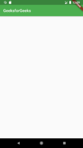
(i) appbar:- It displays a horizontal bar which mainly placed at the top of the Scaffold. appBar uses the widget AppBar which has its own properties like elevation, title, brightness, etc.
Widget build(BuildContext context){returnScaffold(appBar: AppBar(title: Text('GeeksforGeeks'),),
(ii) body:-It will display the main or primary content in the Scaffold. It is below the appBar and under the floatingActionButton. The widgets inside the body are at the left-corner by default.
Widget build(BuildContext context){returnScaffold(appBar: AppBar(title: Text('GeeksforGeeks'),),body: Center(child: Text("Welcome to GeeksforGeeks!!!",style: TextStyle(color: Colors.black,fontSize: 40.0,),),),

(iii) floatingActionButton:-FloatingActionButton is a button that is placed at the right bottom corner by default. FloatingActionButton is an icon button that floats over the content of the screen at a fixed place. If we scroll the page its position won’t change, it will be fixed.
Widget build(BuildContext context){returnScaffold(appBar: AppBar(title: Text('GeeksforGeeks')),body: Center(child: Text("Welcome to GeeksforGeeks!!!",style: TextStyle(color: Colors.black,fontSize: 40.0,),),),floatingActionButton: FloatingActionButton(elevation: 10.0,child: Icon(Icons.add),onPressed: (){// action on button press});}

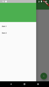
(iv) drawer:-drawer is a slider menu or a panel which is displayed at the side of the Scaffold. The user has to swipe left to right or right to left according to the action defined to access the drawer menu. In the Appbar, an appropriate icon for the drawer is set automatically at a particular position. The gesture to open the drawer is also set automatically. It is handled by the Scaffold.
drawer: Drawer(child: ListView(children: const<Widget>[DrawerHeader(decoration: BoxDecoration(color: Colors.green,),child: Text('GeeksforGeeks',style: TextStyle(color: Colors.green,fontSize: 24,),),),ListTile(title: Text('Item 1'),),ListTile(title: Text('Item 2'),),],),),
(v) bottomNavigationBar:-bottomNavigationBar is like a menu at the bottom of the Scaffold. We have seen this navigationbar in most of the applications. We can add multiple icons or texts or both in the bar as items.
bottomNavigationBar: BottomNavigationBar(currentIndex : 0,fixedColor: Colors.green,items: [BottomNavigationBarItem(title: Text("Home"),icon: Icon(Icons.home), ),BottomNavigationBarItem(title: Text("Search"),icon: Icon(Icons.search), ),BottomNavigationBarItem(title: Text("Profile"),icon: Icon(Icons.account_circle), ),],onTap: (intindexOfItem){}),

(vi) backgroundColor:- used to set the color of the whole Scaffold widget.
void main() => runApp(MyApp());
class MyApp extends StatelessWidget {
@override Widget build(BuildContext context) {
return MaterialApp(
home: Scaffold(
backgroundColor: Color(0xff84FFFF),
body: SafeArea(
child: Center(
child: ( Text(‘Set Scaffold Background Color’) )
)
)
)
);
}}

Find Trusted Cardiac Hospitals
Compare heart hospitals by city and services — all in one place.
Explore Hospitals