1. What is Tableau?
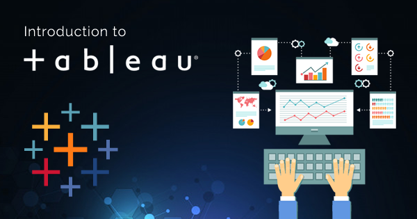
Tableau is a data visualization tool that helps people see and understand their data.
2. What are the different types of data sources that Tableau can connect to?
Tableau can connect to a variety of data sources, including spreadsheets, databases, and cloud services.
3. What is a dimension in Tableau?
During my tableau certification we learned a dimension is a categorical variable that can be used to group and filter data.
4. What is a measure in Tableau?
A measure is a numerical variable that can be used to perform calculations and create visualizations.
5. What is a dashboard in Tableau?
A dashboard is a collection of visualizations that are displayed together on a single page.
6. What is a worksheet in Tableau?
A worksheet is a single visualization that can be added to a dashboard or used on its own.
7. What is a filter in Tableau?
A filter is used to limit the data that is displayed in a visualization.
8. What is a parameter in Tableau?
A parameter is a user-defined variable that can be used to control aspects of a visualization.
9. What is a calculated field in Tableau?
A calculated field is a new field that is created by performing calculations on existing fields.
10. What is a join in Tableau?
A join is used to combine data from two or more tables based on a common field.
11. What is a blend in Tableau?
A blend is used to combine data from two or more data sources based on a common field.
12. What is a hierarchy in Tableau?
A hierarchy is a way of organizing data into levels of detail.
13. What is a group in Tableau?
A group is a way of combining related values into a single category.
14. What is a set in Tableau?
A set is a way of creating a subset of data based on a condition.
15. What is a trend line in Tableau?
A trend line is a line that shows the general direction of a data series.
16. What is a reference line in Tableau?
A reference line is a line that is used to compare data to a benchmark or goal.
17. What is a map in Tableau?
A map is a visualization that shows data on a geographic map.
18. What is a scatter plot in Tableau?
A scatter plot is a visualization that shows the relationship between two variables.
19. What is a bar chart in Tableau?
A bar chart is a visualization that shows data as bars.
20. What is a pie chart in Tableau?
A pie chart is a visualization that shows data as slices of a pie.
21. What is a heat map in Tableau?
A heat map is a visualization that shows data as colors on a grid.
22. What is a tree map in Tableau?
A tree map is a visualization that shows data as rectangles that are sized and colored based on their values.
23. What is a funnel chart in Tableau?
A funnel chart is a visualization that shows data as a funnel shape.
24. What is a bullet chart in Tableau?
A bullet chart is a visualization that shows data as a horizontal bar with a target line.
25. What is a waterfall chart in Tableau?
A waterfall chart is a visualization that shows how a value changes over time or across categories.
26. What is a dual axis chart in Tableau?
A dual axis chart is a visualization that shows two measures on the same chart with different scales.
27. What is a stacked bar chart in Tableau?
A stacked bar chart is a visualization that shows data as stacked bars.
28. What is a packed bubble chart in Tableau?
A packed bubble chart is a visualization that shows data as bubbles that are sized and colored based on their values.
29. What is a Gantt chart in Tableau?
A Gantt chart is a visualization that shows the duration of tasks or projects.
30. What is a box and whisker plot in Tableau?
A box and whisker plot is a visualization that shows the distribution of data.
31. What is a histogram in Tableau?
A histogram is a visualization that shows the frequency of data in bins.
32. What is a line chart in Tableau?
A line chart is a visualization that shows data as a line.
33. What is a dual line chart in Tableau?
A dual line chart is a visualization that shows two measures on the same chart with the same scale.
34. What is a area chart in Tableau?
A area chart is a visualization that shows data as a filled area.
35. What is a stacked area chart in Tableau?
A stacked area chart is a visualization that shows data as stacked filled areas.
36. What is a scatter plot matrix in Tableau?
A scatter plot matrix is a visualization that shows the relationship between multiple variables.
37. What is a highlight table in Tableau?
A highlight table is a visualization that shows data as a table with highlighted values.
38. What is a text table in Tableau?
A text table is a visualization that shows data as a table with text values.
39. What is a pie chart race in Tableau?
A pie chart race is a visualization that shows how the values of a pie chart change over time.
40. What is a slope chart in Tableau?
A slope chart is a visualization that shows the change in values between two points in time.
41. What is a radial chart in Tableau?
A radial chart is a visualization that shows data as a circle with radial lines.
42. What is a spider chart in Tableau?
A spider chart is a visualization that shows data as a spider web with radial lines.
43. What is a waterfall chart in Tableau?
A waterfall chart is a visualization that shows how a value changes over time or across categories.
44. What is a bullet chart in Tableau?
A bullet chart is a visualization that shows data as a horizontal bar with a target line.
45. What is a Pareto chart in Tableau?
A Pareto chart is a visualization that shows the frequency of data in descending order.
46. What is a donut chart in Tableau?
A donut chart is a visualization that shows data as a ring with slices.
47. What is a lollipop chart in Tableau?
A lollipop chart is a visualization that shows data as a line with circles.
48. What is a waterfall chart in Tableau?
A waterfall chart is a visualization that shows how a value changes over time or across categories.
49. What is a bullet chart in Tableau?
A bullet chart is a visualization that shows data as a horizontal bar with a target line.
50. What is a Pareto chart in Tableau?
A Pareto chart is a visualization that shows the frequency of data in descending order.
Related video:

👤 About the Author
Ashwani is passionate about DevOps, DevSecOps, SRE, MLOps, and AiOps, with a strong drive to simplify and scale modern IT operations. Through continuous learning and sharing, Ashwani helps organizations and engineers adopt best practices for automation, security, reliability, and AI-driven operations.
🌐 Connect & Follow:
Website: WizBrand.com
Facebook: facebook.com/DevOpsSchool
X (Twitter): x.com/DevOpsSchools
LinkedIn: linkedin.com/company/devopsschool
YouTube: youtube.com/@TheDevOpsSchool
Instagram: instagram.com/devopsschool
Quora: devopsschool.quora.com
Email– contact@devopsschool.com
Find Trusted Cardiac Hospitals
Compare heart hospitals by city and services — all in one place.
Explore Hospitals