What are Data Visualization Tools?
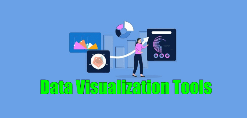
Data Visualization Tools are software applications or platforms that allow users to create interactive and visually appealing representations of data. These tools help transform raw data into charts, graphs, maps, and other visual elements that make complex data more understandable and accessible. Data visualization is a crucial step in data analysis and communication, as it enables users to identify patterns, trends, and insights more effectively.
Top 10 use cases of Data Visualization Tools:
- Exploratory Data Analysis: Understanding the distribution and relationships within datasets.
- Time Series Analysis: Visualizing temporal patterns and trends over time.
- Sales and Marketing Analytics: Presenting sales performance, customer segmentation, and marketing campaign results.
- Financial Analysis: Displaying financial metrics, stock prices, and portfolio performance.
- Geospatial Analysis: Mapping and analyzing data based on geographical locations.
- Business Intelligence Dashboards: Creating interactive dashboards for real-time monitoring and decision-making.
- Social Media Analytics: Visualizing social media trends, sentiment analysis, and engagement metrics.
- Healthcare Analytics: Representing medical data, patient outcomes, and disease trends.
- Operational Analytics: Monitoring operational processes and performance metrics.
- Academic Research: Illustrating research findings and scientific data.
What are the feature of Data Visualization Tools?
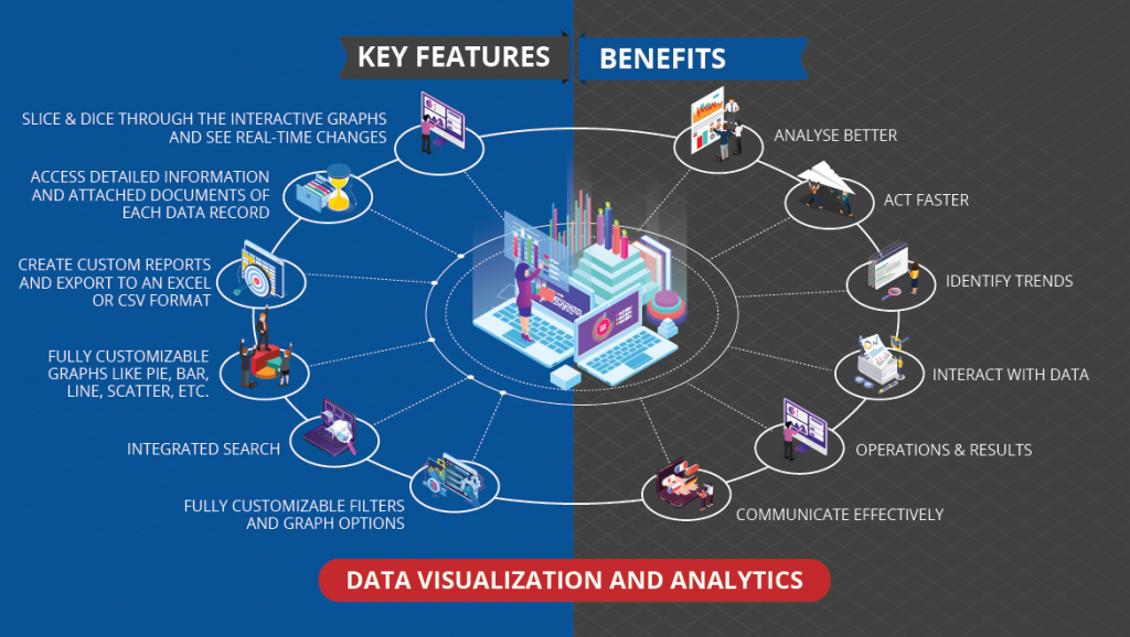
- Data Connectivity: Data visualization tools can connect to various data sources, such as databases, spreadsheets, and cloud storage.
- Visual Elements: They offer a wide range of visual elements like bar charts, line charts, scatter plots, heatmaps, and more.
- Interactivity: Tools provide interactive features like drill-down, filtering, and tooltips for a dynamic user experience.
- Customization: Users can customize visual elements, colors, and themes to match their brand or analysis requirements.
- Responsive Design: Many tools support responsive design to optimize visualizations for different devices.
- Real-time Data: Some tools enable real-time data visualization for monitoring live data streams.
How Data Visualization Tools Work and Architecture?
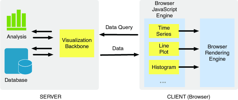
The architecture of data visualization tools can vary based on the specific tool and its functionalities. Generally, they involve the following steps:
- Data Ingestion: Data is ingested from various sources and loaded into the visualization tool.
- Data Preparation: The tool may provide basic data preparation features like cleaning and transformation.
- Visual Mapping: Users map data attributes to visual elements like axes, colors, and shapes.
- Data Rendering: The tool renders the visualizations based on the data and mappings.
- Interactivity: Users can interact with the visualizations, explore data, and apply filters.
- Data Output: Users can save or export the visualizations for presentations, reports, or sharing.
How to Install Data Visualization Tools?
The installation process for data visualization tools depends on the specific tool you want to use. Many data visualization tools are available as standalone applications or cloud-based platforms. Some popular data visualization tools include:
- Tableau: Download the Tableau Desktop installer from the Tableau website and follow the installation instructions.
- Microsoft Power BI: Download the Power BI Desktop installer from the Microsoft website and follow the installation instructions.
- Google Data Studio: Google Data Studio is a web-based tool accessible through a web browser.
Please visit the official websites of the data visualization tools you wish to use for detailed and up-to-date installation instructions specific to each tool.
Basic Tutorials of Data Visualization Tools: Getting Started
Sure! Here are step-by-step basic tutorials for getting started with two popular Data Visualization Tools: Tableau and Microsoft Power BI.
Data Visualization Tool: Tableau
- Installing Tableau:
- Download the Tableau Desktop installer from the Tableau website (tableau.com).
- Run the installer and use the on-screen instructions to accomplish the installation.
2. Connecting Data:
- Launch Tableau Desktop and connect to your data source (Excel, CSV, database, etc.).
- Drag and drop your data fields onto the workspace.
3. Creating Basic Visualizations:
- Build basic visualizations by dragging the required fields onto the “Rows” and “Columns” shelves.
- Choose a visualization type (e.g., bar chart, line chart, pie chart) from the “Show Me” panel.
4. Customizing Visualizations:
- Format and customize the visualizations using options in the “Marks” card and “Format” pane.
- Add labels, tooltips, colors, and legends to enhance the visual appearance.
5. Creating Dashboards:
- Combine multiple visualizations into a dashboard by dragging them onto a new dashboard sheet.
- Arrange and resize the elements to create an interactive dashboard.
6. Adding Interactivity:
- Add filters, parameters, and actions to make the dashboard interactive.
- Use “Dashboard Actions” to create dynamic filtering and highlighting.
7. Sharing Visualizations:
- Save your Tableau workbook and publish it to Tableau Server or Tableau Public for sharing.
Data Visualization Tool: Microsoft Power BI
- Installing Microsoft Power BI:
- Download the Power BI Desktop installer from the Microsoft website (powerbi.microsoft.com).
- Run the installer and use the on-screen instructions to accomplish the installation.
2. Connecting Data:
- Launch Power BI Desktop and connect to your data source (Excel, CSV, database, etc.).
- After Loading the data into the Power BI data model.
3. Creating Basic Visualizations:
- Build basic visualizations by dragging the required fields onto the report canvas.
- Choose a visualization type from the “Visualizations” pane (e.g., bar chart, line chart, pie chart).
4. Customizing Visualizations:
- Format and customize the visualizations using options in the “Visualizations” and “Format” panes.
- Add data labels, colors, and legends to improve visual clarity.
5. Creating Reports:
- Create multiple visualizations in a single report page to tell a data story.
- Arrange and resize the elements to create a cohesive report layout.
6. Adding Interactivity:
- Add slicers and filters to make the report interactive.
- Use bookmarks and drill-through to create a hierarchical navigation.
7. Sharing Reports:
- Save your Power BI report and publish it to Power BI Service for sharing with others.
These tutorials will help you get started with these popular data visualization tools. As you progress, you can explore more advanced features and functionalities to create more sophisticated and insightful visualizations.

👤 About the Author
Ashwani is passionate about DevOps, DevSecOps, SRE, MLOps, and AiOps, with a strong drive to simplify and scale modern IT operations. Through continuous learning and sharing, Ashwani helps organizations and engineers adopt best practices for automation, security, reliability, and AI-driven operations.
🌐 Connect & Follow:
- Website: WizBrand.com
- Facebook: facebook.com/DevOpsSchool
- X (Twitter): x.com/DevOpsSchools
- LinkedIn: linkedin.com/company/devopsschool
- YouTube: youtube.com/@TheDevOpsSchool
- Instagram: instagram.com/devopsschool
- Quora: devopsschool.quora.com
- Email– contact@devopsschool.com
Find Trusted Cardiac Hospitals
Compare heart hospitals by city and services — all in one place.
Explore Hospitals