What is ggplot2?
ggplot2 is an R package for data visualization based on the Grammar of Graphics, a conceptual framework for creating and understanding statistical graphics. Developed by Hadley Wickham, ggplot2 provides a flexible and powerful system for producing high-quality, customized plots and charts.
What is top use cases of ggplot2?
Top Use Cases of ggplot2:
- Exploratory Data Analysis (EDA):
- ggplot2 is widely used for exploratory data analysis, allowing data analysts and researchers to quickly visualize patterns, trends, and relationships within datasets.
- Data Visualization for Reports and Publications:
- Researchers, statisticians, and data scientists use ggplot2 to create publication-quality plots for academic papers, reports, and presentations. Its flexibility and customization options make it suitable for conveying complex data stories.
- Statistical Plots:
- ggplot2 supports a variety of statistical plots, including scatter plots, bar charts, boxplots, histograms, and more. It allows users to incorporate statistical summaries, such as means or regression lines, into visualizations.
- Time Series Analysis:
- Time series data can be effectively visualized applying ggplot2. Users can create line plots, area plots, or other custom visualizations to explore patterns and trends over time.
- Multivariate Analysis:
- For datasets with multiple variables, ggplot2 enables the creation of multivariate visualizations. Scatterplot matrices, heatmaps, and other plots help analyze relationships among variables.
- Interactive Visualizations:
- While ggplot2 itself is primarily static, it can be combined with interactive visualization libraries like Shiny or ggplotly to create interactive plots for web applications and dashboards.
- Data Comparison:
- Users can compare groups or categories in datasets using ggplot2. Grouped bar charts, side-by-side boxplots, and other visualizations aid in comparing and contrasting different subsets of data.
- Spatial Data Visualization:
- ggplot2 supports the visualization of spatial data using geoms and mapping functions. It is often used in conjunction with other spatial libraries to create maps and spatial visualizations.
- Data Storytelling:
- ggplot2 is instrumental in data storytelling by helping users create compelling visual narratives. Sequential plots or faceted visualizations can be used to convey a series of insights effectively.
- Machine Learning Model Evaluation:
- Data scientists often use ggplot2 to visualize the performance of machine learning models, including ROC curves, precision-recall curves, and confusion matrices.
- Custom Theme and Aesthetics:
- ggplot2 allows users to customize the appearance of plots extensively. Themes, colors, fonts, and other aesthetic elements can be adjusted to match the desired style or adhere to specific branding guidelines.
- Biological Data Visualization:
- In fields such as genomics and bioinformatics, ggplot2 is employed to visualize biological data, including gene expression patterns, DNA sequences, and other biological phenomena.
- Educational Purposes:
- ggplot2 is widely used in teaching data visualization and statistics due to its clarity and the ability to demonstrate statistical concepts in a visual and interactive manner.
- Dashboard Creation:
- ggplot2 visualizations can be integrated into dashboard applications using tools like Shiny. This allows users to create dynamic and interactive dashboards for data exploration and presentation.
- Data Wrangling and Transformation:
- ggplot2 seamlessly integrates with the tidyverse, a collection of R packages for data manipulation and analysis. This makes it easy to work with tidy data and perform data transformations before creating visualizations.
ggplot2’s versatility and emphasis on the Grammar of Graphics principles make it a powerful tool for a wide range of data visualization tasks, from simple exploratory plots to complex, publication-ready visualizations. Its consistent syntax and layered approach to building plots make it a popular choice among R users for effective and expressive data visualization.
What are feature of ggplot2?
Features of ggplot2:
- Grammar of Graphics:
- ggplot2 is based on the Grammar of Graphics, which provides a systematic and consistent framework for creating and understanding complex visualizations. This grammar includes components like data, aesthetics, geoms, and facets.
- Layered Plotting System:
- ggplot2 uses a layered plotting system where visualizations are created by adding layers to a plot. Each layer includes data, aesthetics (mapping of variables to visual elements), and geometric objects (geoms) that define the type of plot.
- Flexible Aesthetics:
- Aesthetics in ggplot2 define how variables are mapped to visual properties such as color, size, shape, and position. Users can easily customize aesthetics to create meaningful visualizations.
- Faceting:
- ggplot2 supports faceting, allowing users to create multiple plots based on different subsets of the data. This is useful for comparing groups or exploring patterns across categories.
- Data Transformation and Summarization:
- ggplot2 seamlessly integrates with the tidyverse, facilitating data wrangling and transformation before creating visualizations. Users can filter, aggregate, and transform data within the ggplot2 workflow.
- Themes and Customization:
- ggplot2 provides a range of themes for customizing the appearance of plots. Users can further customize the visual elements, labels, and overall style of the plot to match specific requirements or preferences.
- Support for Different Plot Types:
- ggplot2 supports a wide variety of plot types, including scatter plots, line plots, bar charts, histograms, boxplots, and more. Additional extensions and geoms can be added to create specialized visualizations.
- Statistical Transformation:
- Users can apply statistical transformations to the data within the ggplot2 framework. This includes summary statistics, smoothing curves, and other statistical transformations that enhance the visualization of patterns in the data.
- Coordination Systems:
- ggplot2 supports different coordination systems, allowing users to create plots with different scales, projections, or orientations. This is useful for visualizing data in various ways, such as polar coordinates or log scales.
- Interactive Plotting:
- While ggplot2 itself is primarily static, it can be combined with other R packages like ggplotly or integrated into interactive web applications using Shiny for creating dynamic and interactive plots.
- Ease of Use:
- ggplot2 is designed to be user-friendly and easy to learn. Its consistent syntax and modular approach make it accessible to users at various levels of expertise.
What is the workflow of ggplot2?
Workflow of ggplot2:
- Load the ggplot2 Library:
- Begin by loading the ggplot2 library in R using the
library(ggplot2)command.
- Begin by loading the ggplot2 library in R using the
- Prepare the Data:
- Ensure that the data is in a tidy format, with variables in columns and observations in rows. The tidyverse tools can be used for data preparation and transformation.
- Initialize a ggplot Object:
- Create a ggplot object using the
ggplot()function. Specify the data and aesthetics (mapping variables to visual properties) within this function.
- Create a ggplot object using the
- Add Geometric Objects (Geoms):
- Use the
+operator to add geometric objects (geoms) to the plot. Geoms define the type of plot, such as points, lines, bars, or other visual elements.
- Use the
- Customize Aesthetics and Appearance:
- Customize the aesthetics, such as color, size, and shape, to enhance the visual representation of the data. Add labels, titles, and annotations as needed.
- Facet the Plot (Optional):
- If desired, use the
facet_wrap()orfacet_grid()functions to create faceted plots for different subsets of the data.
- If desired, use the
- Apply Statistical Transformations (Optional):
- Apply statistical transformations using functions like
stat_smooth()to add regression lines or other statistical summaries to the plot.
- Apply statistical transformations using functions like
- Customize Themes (Optional):
- Choose a theme or customize the appearance of the plot using the
theme()function. Themes control aspects like grid lines, axis labels, and overall plot style.
- Choose a theme or customize the appearance of the plot using the
- Display or Save the Plot:
- Use the
print()function to display the plot or save it to a file using functions likeggsave().
- Use the
- Iterative Exploration and Refinement:
- ggplot2 encourages an iterative workflow, allowing users to explore and refine visualizations incrementally. Users can add layers, tweak aesthetics, and experiment with different plot types.
- Interactive Exploration (Optional):
- If interactivity is desired, the plot can be made interactive using additional packages like ggplotly or integrated into interactive web applications using Shiny.
- Document and Share:
- Once satisfied with the visualization, document the code and share the plot in reports, presentations, or publications. Export the plot as needed for inclusion in external documents.
The ggplot2 workflow is modular and allows users to build complex visualizations step by step. Its layered approach and emphasis on the Grammar of Graphics principles make it a powerful tool for creating expressive and informative data visualizations in R.
How ggplot2 Works & Architecture?
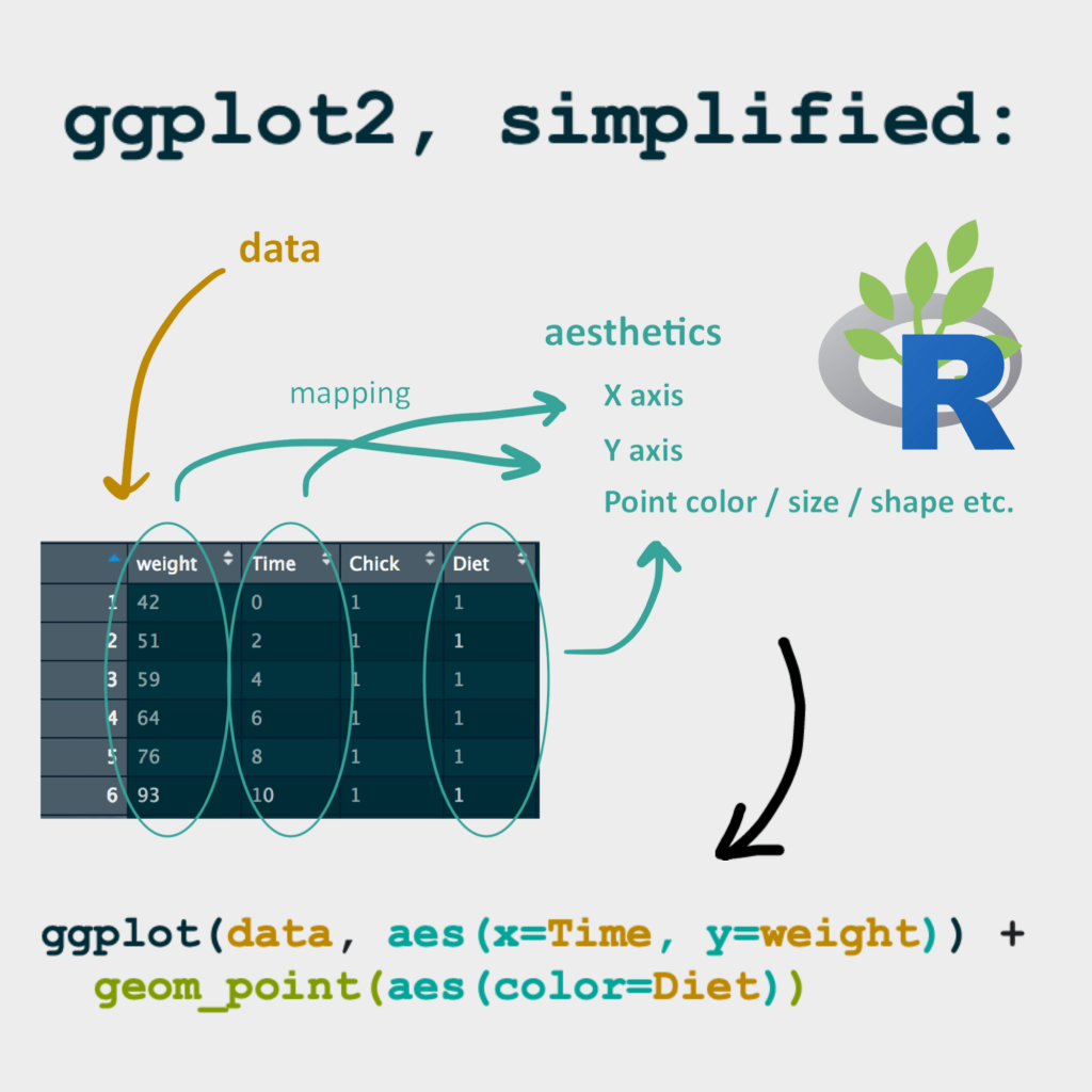
ggplot2 is a powerful graphing library in R for creating compelling data visualizations. It utilizes a layered grammar of graphics approach, making it flexible and intuitive to use. Here’s a breakdown of its workings and architecture:
Core Principles:
- Data-driven: Plots are directly derived from your data, ensuring accuracy and clarity.
- Layered grammar: Each plot element corresponds to a separate layer, allowing for easy customization and combination.
- Aesthetics mapping: Data attributes are mapped to visual aesthetics like color, size, shape, etc., for meaningful representation.
- Facets and grobs: Plots can be divided into facets (sub-plots) and organized using geometric objects (grobs).
Workflow:
- Load and prepare data: Import your data into R and manipulate it as needed.
- Create a ggplot object: Use the
ggplot()function, specifying your data source. - Add geom layers: Use geom functions like
geom_point(),geom_bar(), orgeom_line()to add visual elements like points, bars, or lines based on your data. - Map aesthetics: Use
aes()within each geom layer to map data attributes to visual properties like color, size, shape, etc. - Faceting (optional): Use
facet_wrap()orfacet_grid()to create sub-plots based on categorical variables. - Customization: Apply themes, labels, axes, and annotations to refine your plot’s appearance.
Architecture:
ggplot2 consists of multiple components:
- Data: Your data frame drives the entire plot.
- Mappings: Aesthetics are mapped to data attributes using
aes(). - Geoms: Each visual element (points, bars, lines) is represented by a geom function.
- Stats: Statistical calculations are applied to data as needed by geoms.
- Scales: Data values are mapped to visual ranges for axes, colors, etc.
- Facets: Sub-plots based on categorical variables.
- Themes: Predefined styles for consistent plot layouts.
Benefits:
- Flexibility: Create a wide variety of plot types with ease.
- Code clarity: Layered grammar leads to readable and maintainable code.
- Aesthetic appeal: Produce attractive and informative visualizations.
- Extensible: Integrates with other R packages for advanced features.
So, dive into the world of ggplot2 and unlock the power of data visualization in R!
How to Install and Configure ggplot2?
Here’s how to install and configure ggplot2 in R:
Installation:
- Open RStudio or your preferred R environment.
- Install the ggplot2 package using
install.packages(): Rinstall.packages("ggplot2") - Load the package into your current R session: R
library(ggplot2)
Configuration (Optional):
- Default theme: ggplot2 has a default theme, but you can customize it using
theme_set(): Rtheme_set(theme_bw()) # Set a black-and-white theme - Custom themes: Create your own themes for consistent styling across multiple plots.
- Global options: Set global options like font size using
theme_update().
Troubleshooting:
- Check installation: If you encounter issues, ensure ggplot2 is installed correctly using
installed.packages(). - Loading issues: If loading fails, try reinstalling:
install.packages("ggplot2", dependencies = TRUE)
Once you’ve installed and loaded ggplot2, you’re ready to start creating beautiful visualizations!
Fundamental Tutorials of ggplot2: Getting started Step by Step
Following is a step-by-step fundamental tutorial on ggplot2, incorporating key concepts and hands-on examples:
1. Load Data and Libraries:
- Load the ggplot2 library: R
library(ggplot2) - Import your data (e.g., from a CSV file): R
data <- read.csv("your_data.csv")
2. Create a Basic Plot:
- Start with
ggplot(), specifying data: Rggplot(data = data) - Add a geom layer (e.g., scatter plot): R
ggplot(data = data) + geom_point(aes(x = x_variable, y = y_variable))
3. Map Aesthetics:
- Use
aes()to map data variables to visual properties: Rggplot(data = data) + geom_point(aes(x = Sepal.Length, y = Sepal.Width, color = Species))
4. Add More Geoms:
- Combine multiple geoms for different visualizations: R
ggplot(data = data) + geom_point(aes(x = Sepal.Length, y = Sepal.Width)) + geom_smooth(aes(x = Sepal.Length, y = Sepal.Width))
5. Customize Appearance:
- Labels, titles, themes: R
ggplot(data = data) + geom_point(aes(x = Sepal.Length, y = Sepal.Width)) + labs(x = "Sepal Length", y = "Sepal Width", title = "Iris Data") + theme_bw()
6. Faceting:
- Create sub-plots based on categories: R
ggplot(data = data) + geom_point(aes(x = Sepal.Length, y = Sepal.Width)) + facet_wrap(~ Species)
7. Advanced Customization:
- Explore more geoms, scales, themes, and annotations.
- Refer to the ggplot2 documentation and online resources for further details.
Notes:
- Practice with different datasets and visualizations to solidify your skills.
- Experiment with various combinations of geoms, aesthetics, and themes.
Happy plotting with ggplot2!

Find Trusted Cardiac Hospitals
Compare heart hospitals by city and services — all in one place.
Explore Hospitals