What is Tableau?
Tableau is a powerful data visualization and business intelligence tool that allows users to connect to various data sources, transform raw data into understandable visualizations, and gain insights from their data. It’s known for its user-friendly interface and interactive capabilities, making it popular among analysts, business professionals, and data enthusiasts. Tableau enables users to create interactive dashboards, reports, and charts without requiring extensive coding or technical expertise.
Top 10 use cases of Tableau:
Here are the top 10 use cases of Tableau:
- Data Visualization: Tableau excels in creating compelling visualizations from complex datasets. Users can generate interactive charts, graphs, maps, and other visual elements that help in understanding patterns, trends, and outliers in the data.
- Business Reporting: Tableau allows organizations to create interactive and dynamic reports that provide insights into various aspects of their business operations. These reports can be automatically updated as new data becomes available.
- Dashboard Creation: Users can build interactive dashboards that consolidate multiple visualizations into a single view. Dashboards enable decision-makers to quickly grasp the key performance indicators (KPIs) and metrics that matter most to their business.
- Data Exploration: Tableau enables users to explore data in an intuitive way by dragging and dropping dimensions and measures onto a canvas. This helps in identifying correlations, anomalies, and potential areas of interest.
- Real-Time Analytics: Tableau can connect to real-time data sources, allowing organizations to monitor and analyze data as it’s generated. This is particularly useful for tracking live events or situations that require immediate attention.
- Predictive Analytics: While not a full-fledged machine learning tool, Tableau supports some predictive analytics capabilities. Users can create forecasts, trend analyses, and perform simple predictive modeling using built-in functions.
- Geospatial Analysis: Tableau can generate geographic visualizations that display data on maps. This is valuable for analyzing location-based data, identifying regional trends, and making location-specific decisions.
- Marketing Analysis: Marketers can use Tableau to analyze campaign performance, customer behavior, conversion rates, and other marketing-related metrics. Visualizations help in understanding the effectiveness of different marketing strategies.
- Sales and Revenue Analysis: Tableau can be used to create sales dashboards that provide insights into revenue, sales trends, customer segmentation, and other metrics crucial for sales management.
- Supply Chain and Inventory Management: Organizations can use Tableau to monitor supply chain operations, track inventory levels, analyze demand patterns, and optimize their logistics processes.
These are just a few examples of how Tableau can be applied across different industries and sectors. Its versatility and ease of use make it a valuable tool for anyone who needs to analyze and present data in a visual and interactive manner.
What are the feature of Tableau?
Tableau offers a wide range of features that make it a powerful data visualization and business intelligence tool. The following are the main features of Tableau:
- Data Connection: Tableau can connect to various data sources, including databases, spreadsheets, cloud services, and more. It favors both semi-structured data and structured.
- Data Transformation: Tableau provides a range of tools for data cleansing, transformation, and aggregation. Users can create calculated fields, apply filters, pivot data, and perform other data preparation tasks.
- Drag-and-Drop Interface: One of the standout features of Tableau is its intuitive drag-and-drop interface. Users can create visualizations by dragging dimensions, measures, and attributes onto a canvas.
- Interactive Dashboards: Tableau allows users to create interactive dashboards that combine multiple visualizations into a single view. Users can interact with the data, apply filters, and drill down into specific details.
- Data Visualization: The tool offers a variety of visualization options, including bar charts, line charts, scatter plots, heat maps, geographic maps, and more. Users can customize the appearance and formatting of these visualizations.
- Real-Time Data: Tableau supports real-time data streaming, enabling users to analyze live data and receive immediate insights.
- Web-Based Sharing: Tableau Server and Tableau Online enable users to publish their dashboards and visualizations to the web. This allows stakeholders to access and interact with the data without needing the Tableau desktop application.
- Collaboration: Users can comment on dashboards, share insights, and collaborate on analyses within the Tableau platform.
- Predictive Analytics: While not as robust as dedicated machine learning tools, Tableau supports basic predictive analytics, allowing users to create forecasts and trend analyses.
- Mobile Accessibility: Tableau dashboards are responsive and can be accessed on various devices, ensuring that users can view and interact with data on the go.
- Security and Permissions: Tableau offers security features to control access to data and dashboards. Administrators can define user roles, permissions, and data source connections.
- Embedding: Tableau visualizations can be embedded into other web applications, portals, or websites, extending their reach and accessibility.
How Tableau works and Architecture?
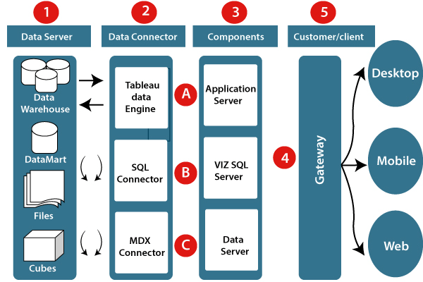
Tableau’s architecture is designed to handle data processing and visualization efficiently. Here’s an overview of its architecture:
- Data Sources: Tableau can connect to a wide range of data sources, including databases, files, cloud services, and web data connectors.
- Data Engine: The Tableau data engine is an in-memory database that optimizes the performance of queries and data processing. It loads and compresses data, making it faster to query and visualize.
- Data Connector: The data connector establishes a connection between Tableau and various data sources. It can translate database queries and optimize them for the data engine.
- Data Model: The data model defines how data fields relate to each other. Tableau automatically generates a data model based on the data source schema and user interactions.
- Calculation Engine: This engine handles calculations, aggregations, and transformations defined by users through calculated fields, table calculations, and other functions.
- VizQL Server: The VizQL Server translates user interactions into visualizations. It generates queries for the data engine and renders the resulting data as visualizations on the user interface.
- Repository: The repository stores metadata about workbooks, dashboards, users, permissions, and other administrative information.
- Presentation Layer: This is the user interface where users interact with the data. They create visualizations, build dashboards, and explore insights.
- Tableau Server or Tableau Online: These platforms allow for sharing, publishing, and collaborating on dashboards over the web. They also manage user access and permissions.
Overall, Tableau’s architecture is designed to provide a seamless experience for data visualization, analysis, and collaboration, utilizing in-memory processing and intuitive user interfaces.
How to Install Tableau?
There are two ways to install Tableau:
- Using the Tableau Desktop installer:
- Go to the Tableau website and download the Tableau Desktop installer for your operating system.
- After running the installer and applying the live-screen instructions.
- Using the Tableau Public installer:
- Go to the Tableau website and download the Tableau Public installer for your operating system.
- After running the installer and applying the live-screen instructions.
Once you have installed Tableau, you can start creating visualizations and dashboards.
Here are the detailed steps on how to install Tableau using the Tableau Desktop installer:
- Go to the Tableau website and download the Tableau Desktop installer for your operating system.
- After running the installer and applying the live-screen instructions.
- On the first screen, accept the terms of the license agreement and click Next.
- On the second screen, select the installation options that you want and click Next.
- On the third screen, select the folder where you want to install Tableau and click Install.
- The installer will start installing Tableau. This may take a few minutes.
- Once the installation is complete, click Finish.
Once you have installed Tableau Desktop, you can start creating visualizations and dashboards.
Here are the detailed steps on how to install Tableau using the Tableau Public installer:
- Go to the Tableau website and download the Tableau Public installer for your operating system.
- After running the installer and applying the live-screen instructions.
- On the first screen, accept the terms of the license agreement and click Next.
- On the second screen, select the installation options that you want and click Next.
- On the third screen, select the folder where you want to install Tableau Public and click Install.
- The installer will start installing Tableau Public. This may take a few minutes.
- Once the installation is complete, click Finish.
Once you have installed Tableau Public, you can start creating visualizations and dashboards that can be shared with others.
Basic Tutorials of Tableau: Getting Started

Here are some step-by-step basic tutorials of Tableau:
- Create a simple bar chart:
- Open Tableau Desktop.
- In the Data pane, click Add Data.
- Choose the data source that you want to apply.
- In the Data Source window, click Connect.
- In the Worksheet pane, drag the field that you want to use for the x-axis to the Columns shelf.
- Drag the field that you want to use for the y-axis to the Rows shelf.
- Click the Marks button and select Bar.
- Your bar chart will be created.
- Create a simple line chart:
- Follow the steps above to create a simple bar chart.
- In the Marks pane, select Line.
- Your line chart will be created.
- Create a simple pie chart:
- Follow the steps above to create a simple bar chart.
- In the Marks pane, select Pie.
- Your pie chart will be created.
- Create a simple dashboard:
- Create a few worksheets with different visualizations.
- In the Dashboard pane, drag the worksheets to the dashboard.
- Resize and arrange the worksheets on the dashboard.
- Add titles and labels to the worksheets.
- Your dashboard will be created.

👤 About the Author
Ashwani is passionate about DevOps, DevSecOps, SRE, MLOps, and AiOps, with a strong drive to simplify and scale modern IT operations. Through continuous learning and sharing, Ashwani helps organizations and engineers adopt best practices for automation, security, reliability, and AI-driven operations.
🌐 Connect & Follow:
- Website: WizBrand.com
- Facebook: facebook.com/DevOpsSchool
- X (Twitter): x.com/DevOpsSchools
- LinkedIn: linkedin.com/company/devopsschool
- YouTube: youtube.com/@TheDevOpsSchool
- Instagram: instagram.com/devopsschool
- Quora: devopsschool.quora.com
- Email– contact@devopsschool.com
Find Trusted Cardiac Hospitals
Compare heart hospitals by city and services — all in one place.
Explore Hospitals