
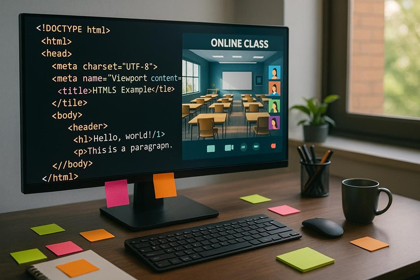
To build a virtual classroom, you need to grasp HTML5 layouts. Use semantic elements like <header>, <nav>, <section>, and <footer> for better accessibility and SEO. Make certain your portal’s design is responsive for various devices, and integrate multimedia features to enhance engagement. Incorporate interactive quizzes and gamification techniques to motivate students. Following best practices will help create a user-friendly online environment. You’ll discover more strategies and trends that can elevate your online education experience.
How to Understand the Basics of HTML5 Layouts
Understanding the fundamentals of HTML5 layouts is essential for building effective virtual classrooms. Grasping HTML5 basics enables you to create structures that support a seamless learning experience.
Start by familiarizing yourself with layout principles, like the use of semantic elements, which enhance accessibility and SEO. You’ll want to utilize elements such as <header>, <nav>, <section>, and <footer> to organize content logically.
Flexbox and CSS Grid are powerful tools that give you control over the design, allowing for responsive layouts. By applying these techniques, you can create flexible environments that adapt to various devices, ensuring that students have the freedom to access learning materials anytime, anywhere.
Mastering these core concepts lays the groundwork for engaging online education experiences.
Key Features of HTML5 Layouts for Interactive Learning
When creating interactive learning experiences with HTML5, you’ll want to focus on key features that enhance user engagement.
Responsive design principles guarantee your layouts adapt to various devices, while integrating interactive elements makes content more engaging.
Additionally, multimedia support features allow for a richer learning experience, incorporating videos, audio, and animations seamlessly.
Responsive Design Principles
Responsive design principles are crucial for creating effective HTML5 layouts in virtual classrooms, as they guarantee that content adapts seamlessly across various devices and screen sizes.
By implementing mobile responsiveness, you make certain that students can access learning materials on smartphones, tablets, or desktops without losing functionality. This adaptability not only enhances the user experience but also encourages engagement.
Additionally, adhering to accessibility standards is important. This means using semantic HTML5 elements, alt text for images, and ARIA roles to make sure all learners, including those with disabilities, can navigate your content easily.
Prioritizing these principles in your design process will foster an inclusive environment, making your virtual classroom a more dynamic and effective space for interactive learning.
Interactive Elements Integration
Incorporating interactive elements into your HTML5 layouts greatly enhances the learning experience in virtual classrooms. By integrating interactive quizzes, you engage students more effectively, allowing them to assess their understanding in real-time.
These quizzes can offer instant feedback, fostering a sense of accomplishment and encouraging further exploration of the material.
Additionally, gamified learning transforms traditional education methods. You can design activities that reward students for completing tasks, earning points or badges, which keeps them motivated.
HTML5 supports dynamic content such as animations and responsive interfaces, making these features accessible across devices.
Multimedia Support Features
HTML5 offers multiple multimedia support features that greatly enhance interactive learning experiences.
With seamless multimedia integration, you can easily incorporate audio visual resources into your online classroom. This capability allows for dynamic content delivery, keeping learners engaged and motivated.
Here are some key features you can leverage:
- Video and Audio Elements: Embed videos and audio files directly into your pages without needing additional plugins.
- Canvas API: Create interactive graphics and animations, making lessons visually stimulating.
- Accessible Media Controls: Users can easily play, pause, and adjust settings, ensuring a personalized experience.
HTML5 Layout Best Practices for Responsiveness
To create responsive layouts in HTML5, you should implement fluid grid systems that adjust to various screen sizes.
Utilizing media queries is essential for tailoring your design elements based on device characteristics.
Together, these practices guarantee a seamless experience across all platforms.
Fluid Grid Systems
Fluid grid systems are essential for creating responsive layouts in modern web design. By utilizing fluid layouts, you can guarantee your online school portal adapts seamlessly across various devices.
Grid systems provide a structured approach to arranging content, enabling a flexible design that maintains visual harmony.
- Proportional units: Use percentages instead of fixed pixel values to allow elements to resize naturally.
- Flexible columns: Implement a grid structure with adjustable columns that can stack or align based on screen size.
- Consistent alignment: Maintain alignment across different devices to enhance user experience and readability.
Adopting these practices will empower you to build a dynamic and user-friendly virtual classroom that meets diverse needs.
Media Query Utilization
Effective media query utilization is essential for guaranteeing your virtual classroom adapts to various screen sizes and orientations. By implementing media queries, you can create adaptive layouts that respond dynamically to the user’s device.
Start with a mobile-first approach—designing for smaller screens first—and then use media queries to adjust your styles for larger screens. This guarantees a seamless experience across devices.
Specify breakpoints based on your content, not arbitrary pixel values. For example, you might set a breakpoint at 768px for tablets and another at 1024px for desktops.
Remember to include conditions for orientation changes as well. With proper media query utilization, your online school portal will effectively engage users, providing them the freedom to learn on any device.
How to Create User-Friendly Online School Portals
Creating a user-friendly online school portal is essential for enhancing the learning experience, as it directly impacts student engagement and accessibility.
To achieve an ideal user interface and improve user experience, consider these key elements:
- Intuitive Navigation: Confirm menus are clear and accessible, allowing users to find information quickly.
- Responsive Design: Adapt layouts for various devices, providing a seamless experience for students enrolled in a virtual elementary school whether they’re using a desktop, tablet, or mobile device.
- Consistent Branding: Maintain a cohesive visual identity that reflects your institution’s values, making the portal inviting and recognizable.
Using Multimedia Elements to Boost Student Engagement
When you integrate multimedia elements into your online classrooms, you not only enhance the learning experience but also capture student interest. Using videos, interactive quizzes, and infographics can greatly boost student interaction.
These tools create an immersive environment where learners feel more connected to the content. For instance, embedding a video clip relevant to your lesson can clarify complex topics and stimulate discussion.
Additionally, interactive elements, like polls or simulations, encourage participation and critical thinking. Multimedia integration doesn’t just cater to different learning styles; it also fosters a sense of community among students.
What’s Next for HTML5 in Online Learning?
As multimedia elements continue to enrich online learning environments, HTML5 plays a pivotal role in shaping the future of virtual classrooms.
You can expect HTML5 to drive significant advancements in online education through:
- Adaptive Learning: Personalized experiences can be created, tailoring content to individual student needs and learning paces.
- Mobile Access: With HTML5’s responsive design, students can easily access materials on various devices, ensuring seamless learning anytime, anywhere.
- Interactive Features: Enhanced interactivity will foster engagement, allowing for real-time quizzes, discussions, and collaborative projects.
Future Trends of HTML5 in Education
While HTML5 has already transformed online education, its future promises even more innovative trends that can enhance teaching and learning experiences.
Expect to see increased emphasis on HTML5 accessibility, making learning environments more inclusive for all students. This guarantees that everyone, regardless of ability, can engage with content seamlessly.
Additionally, gamification strategies will gain traction, integrating game-like elements into educational platforms to boost engagement and motivation. You’ll find features like progress tracking, rewards, and interactive challenges that make learning feel less like a chore and more like an adventure.
As these trends evolve, you’re likely to see a more dynamic, user-centered approach to online education, fostering creativity and collaboration in virtual classrooms.
Conclusion
Incorporating HTML5 layouts in online school portals transforms the learning experience, making it more interactive and engaging. Did you know that 70% of students report better retention of information when multimedia elements are included? By leveraging HTML5’s key features and best practices, you can create user-friendly interfaces that adapt seamlessly across devices. As we look to the future, embracing emerging trends in HTML5 will further enhance educational outcomes, making learning more accessible and effective for all students.

I’m Rajesh Kumar, a DevOps, SRE, DevSecOps, Cloud, and Platform Engineering expert passionate about sharing practical knowledge, real-world experiences, and industry best practices. I have worked at Cotocus and regularly write about technology, travel, investing, health, product reviews, and digital marketing through my various platforms.
I publish technical articles at DevOps School, travel stories at Holiday Landmark, stock market insights at Stocks Mantra, health and fitness guidance at My Medic Plus, product reviews at TrueReviewNow, and SEO and digital marketing strategies at Wizbrand.
Find Trusted Cardiac Hospitals
Compare heart hospitals by city and services — all in one place.
Explore Hospitals
What’s missing here is the real-world production complexity of running a virtual classroom system, especially around scalability during peak concurrent sessions where video, chat, and interactive content compete for bandwidth and backend resources. In practice, the harder problem isn’t HTML5 layout design but ensuring low-latency performance across devices and unstable network conditions, particularly in regions with inconsistent connectivity. The article also doesn’t cover accessibility and cross-device consistency challenges, where classrooms must remain usable on low-end mobiles, tablets, and desktops without breaking UX or learning flow, nor the ongoing need for real-time monitoring of session quality and user engagement drop-offs in live learning environments.